Update: First Look at New Homepage Design
Posted by : Premraj | Posted on : Thursday, September 24, 2009

We are just a couple of weeks away from the latest BudgetPulse site update. We have taken a lot of suggestions from the users for this release as we have done in the past and we have been working hard to improve the tool for everyone.
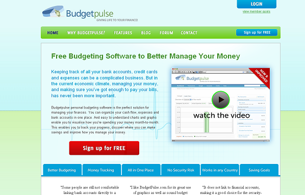
Although our site redesign received a ton of positive responses, there was still some users who had issues with the color scheme because it lacked proper color contrast, and it hurt their eyes. We have worked with a BudgetPulse user to fix this problem and she has helped us redesign the homepage, as well as helped with the overall color scheme.
Here is the first look of the new BudgetPulse Homepage:
For a full look at the homepage in your browser, please click here.
What do you think of the new homepage design and the new color scheme? We would love to hear your thoughts.
 SU
SU REDDIT


